HSL Picker
- React
- Typescript
- CSS
- Vite
- Vitest
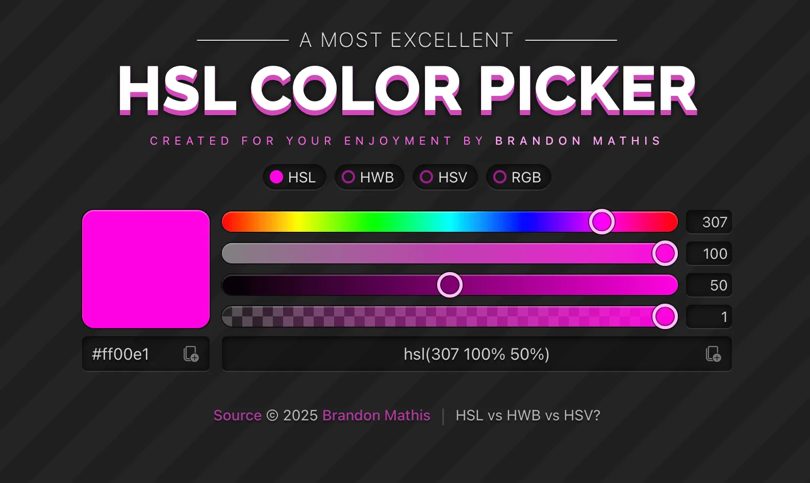
I started this project in 2011 to learn about different color spaces and experiment with new technologies. Today it’s a modern React/TypeScript app that also supports HWB and HSV color spaces. It has around 40k unique visitors a month.
Court Shuffle
- React
- Typescript
- CSS
- Vite
- Convex
- Zustand
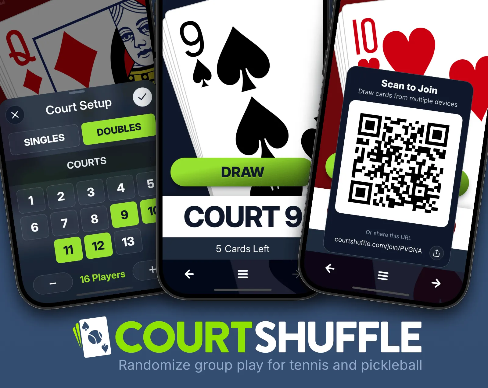
I wrote this app to help tennis and pickleball players easily organize casual play. Select your court numbers and let everyone draw a card. The number matches the court and the suit helps you find a parnter or opponent. I built this app as a PWA so users can install it to their homescreen for offline use. It if you have an good signal, you can share the deck and draw from multiple devices and it's all synced instantly with a Convex backend.
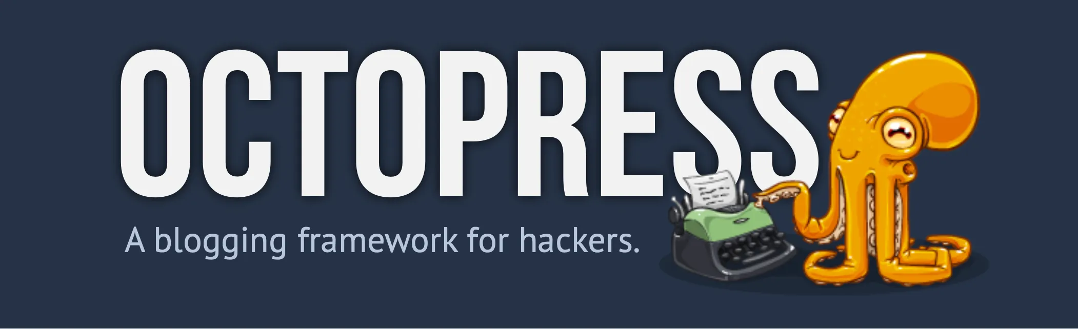
During the great indie blogging bubble, I built Octopress, a powerful companion to the Jekyll blogging engine, designed to give developers a beautiful way to blog. With over 2.5k forks and more than 9k stars on GitHub, it remains my most widely known project. More than just a Jekyll theme, it included a robust code-highlighting system, social feeds (when those were prevalent), and a suite of powerful shell scripts to automate managing drafts, publishing, and even a hooks framework to prioritize plugin patches.